Thursday, August 27, 2009

PFF - Plaid Campus Fashions for Fall - 1960 Style


This postcard advertising back to school fashions was actually sent to me back when I was in high school. I was "personally" invited to "preview the season's most exciting sweaters, companion skirts and all the best co-ordinated sportswear."

Plaid is again--or maybe still--popular for fall. Try googling "plaid for fall" and you will get a lot of hits. Vintage and retro fashions are popular too. I kind of like those brown saddle shoes, but I can't see myself wearing that kind of clothes now. Do you think you could wear things like this without feeling ridiculous?


Wednesday, August 26, 2009

VTT - Stork Announcement & Baby Book


This postcard is one of ten designs of "Stork Announcements" by artist E. B. Weaver. I think it is probably from the 1920s or earlier (much older than me).

The baby book shown here is mine. Unfortunately there is little information filled in, but there were some interesting mementos saved in it. The book is in very good condition because it was kept in the box.


According to the label on the back of the box, this baby book is "famous" and was advertised in several magazines. Our Baby's First Seven Years was published by The Mother's Aid of the Chicago Lying-in Hospital, University of Chicago. This baby book was first published in 1928. My book is the "New and Revised Edition Copyright 1943."

I was amazed to discover that this book has gone through a number of revisions and is still being sold (Our Baby's First Seven Years). New editions involving new design, art, text, and typeface were published in 1941, 1958, 1969, 1982, and 1989. A 1987 Associated Press article noted that over 8 million copies had been sold, generating money used for maternity research. The seventh edition was published in 2000 and includes the latest medical knowledge and philosophy of child care. The newer books are in the form of a loose leaf binder instead of a bound book.

I found someone else's blog (
Sean on Family History) that shows interior Images from a Baby Book, 1956 that are similar to my book.


Vintage Thingies Thursdays

Saturday, August 22, 2009

Aloha from Hawaii

Thanks to a post in the Life in a Postcard Mirror blog, I learned that yesterday (August 21) was the 50th anniversary of Hawaiian statehood. After reading that blog and viewing old postcards of Hawaii from the Curt Teich Archives there, I decided to take a look at some vintage Hawaii postcards of my own.


The first postcard was issued by Northwest Airlines circa 1951. It reminds me of my fourth grade teacher who previously taught in Hawaii. That sounded very exotic to me, and I still remember learning about "aloha," luaus, poi, etc. from her.

On the back of the Northwest Airlines postcard is this description:

"Whether you are a Malihini (newcomer) or a Kamaaina (old timer) you will find a wonderful Aloha awaiting you in Hawaii, a Paradise of the Pacific. Northwest Airlines Hawaiian Express gives you the only Stratocruiser service from New York and other great cities of the East across the country to Seattle connecting there with your direct Northwest flight to Honolulu…
"


The second postcard was mailed in 1960 and tells the various meanings of "aloha" on the back: "Aloha means 'Hello,' 'Goodbye,' "Welcome,' 'Love,' depending upon phrasing, but always recognized the world over and identified with beautiful Hawaii."


The third postcard is a Hawaii state map from the early 1960s.


The last postcard is a map of the Island of Oahu, with enlarged details of the city of Honolulu and Waikiki Beach. It is a "Nani Li'i Natural Color Card"--Nani Li'i means "Little Beauty" in Hawaiian.

Honolulu is where President Barack Obama was born on August 4, 1961. Hawaii's Official Tourism Site has a page about Barack Obama's Hawaii. It is said there that "There can be no doubt that growing up in this idyllic, multicultural setting was a major influence in shaping who Obama is today."


Thursday, August 20, 2009

PFF -- Vintage Postcards & Servicemen


This is a photo from the Prints and Photographs Online Catalog of the Library of Congress. It is one I found when I searched for photos of mailboxes and postcards. It is dated 1941 and the title is "Post cards for sale at a novelty goods store just outside Camp Stewart, near Hinesville, Georgia." I think it is always interesting to see vintage postcard racks, but what is really special in this one is that I recognized one of my postcards in the middle of the rack--the "It Floats" lady. I wouldn't be surprised if I have one of the others, but the others are too hard to see. Look at the price--4 for 5¢! I wish I could go back in time and buy some.


Probably most people know that fat people float better than skinny people. If you are young or not a native of the United States, you probably don't know that "It Floats" is a famous advertising slogan for Ivory Soap.

A 1944 magazine
article "Post Card Parade" by Oren Arnold (July 29 issue of Saturday Evening Post), has some interesting facts about postcards and the WWII era servicemen. During WWII servicemen increased postcard sales more than 100 per cent. Although the servicemen did buy many postcards of girls, the best-selling postcards were the cartoon cards in which the soldier was the butt of the joke.


Wednesday, August 19, 2009

VTT - Wild Roses - Western Women, Tea, & Pyrography


This artwork on this postcard was designed for Celestial Seasonings Cinnamon Rose Herb Tea, ©1980. The artist is Norman Green.

After much searching, I still haven't figured out whether "wild roses" and "cinnamon roses" are the same thing. Most, but not all, pictures of cinnamon roses look like the wild roses on the wood burnt plaque. The roses on the postcard don't look like the typical wild rose. Some wild roses smell like cinnamon, but I don't know whether all of them do. Can anyone clarify what a wild and/or cinnamon rose is?

Wild roses seem to be frequently associated with western themes. Does anyone know why?


size 12" X 17"

Pyrography, the art of wood burning, was very popular in the early twentieth century. This "Wild Rose" plaque was manufactured by the Flemish Art Company, the largest and best-known manufacturer of pyrographic tools and wooden objects with designs to be burned by hobbyists. Plaques and boxes were the most common objects. More information on the Flemish Art Company and the manufacturing process is at the E-Museum of Pyrographic Art.

Saturday, August 15, 2009

St. Lawrence Seaway Maximum Card -- Festival of Postcards


I was planning to show this postcard a couple of months ago, but I decided to save it for the Water Issue of the Festival of Postcards. Meanwhile, Evelyn at A Canadian Family did a post with this same postcard for the 50th Birthday of the St. Lawrence Seaway, which opened in 1959. Her postcard, however, does not have the postage stamps. The stamps and postmark are what make this postcard especially interesting. [Note: After I wrote this, I was surprised to discover that I also have one of these postcards without stamps on the picture side. It was sent to me from Montreal by my father in 1961!]

This is an example of a maximum card, which is a postcard with a postage stamp on the picture side of the card where the stamp and card have the same subject and are canceled with a relevant postmark. This also is an example of a joint issue stamp, where two or more countries issue stamps with identical or similar designs to commemorate something of common interest. Both the United States and Canada issued St. Lawrence Seaway commemorative stamps with nearly identical designs. This was the first time that the U.S. participated in a joint issue.

This postcard has a first day of issue postmark (the words "first day of issue" are surrounded by horizontal bars and are just below the U.S. stamp. The round postmark on the far left is dated June 26, 1959 from Massena, N.Y.Massena is approximately in the center of this postcard. The locks in Massena are the only American-owned shipping locks on the St. Lawrence Seaway. To the right of the Massena postmark is another round postmark with the words "St. Lawrence Seaway Development Corporation" and "United States of America."


This postcard map shows the portion from Montreal, Quebec, in the east (at the bottom) to Cleveland, Ohio, United States in the west (at the top). There is an additional Great Lakes portion that goes further west to Duluth, Minnesota on Lake Superior. The complete Great Lakes St. Lawrence Seaway system from the Atlantic Ocean to Duluth is 2,038 nautical miles (2,342 statute miles or 3,700 kilometers).

More information:
Great Lakes St. Lawrence Seaway System


This post was written for
A Canadian Family
A Festival of Postcards Blog Carnival

4th Edition, August 2009: Water

Wednesday, August 12, 2009

VTT - Scuola Mazzon Postcards & Funny Face Potholders


I have had these Scuola Mazzon art postcards for many years, but I didn't realize what they really were until I started thinking about what postcards resembled the Funny Face potholders. I had assumed that "Scuola Mazzon" was the artist's name. I just recently realized that "Scuola Mazzon" is Italian for "Mazzon School." These four postcards show work by four different 13- and 14-year-old students--Ezio Sgarbi, Graziella Pozzi, Eugenia Caimi, Giorgina Lanzi. The art was done between 1950 and 1954.

The Mazzon School was an art school for children founded in 1929 by the Italian artist Galliano Mazzon (1896 - 1978). According to a British Museum webpage (with text quoted from Martin Hopkinson, 'Italian Prints 1875-1975'), "Mazzon challenged accepted academic methods, banning his students from copying from nature, and encouraging spontaneous expression of the emotions, fantasy, the imagination, and dreams."

There seems to be a difference of opinion about whether the school encouraged "spontaneous" expression. A review in Art Digest of a 1955 Mazzon School exhibit at the Museum of Modern Art says that "the teaching method represented in these pictures, emphasizes not the spontaneous approaches encouraged in more creative American schools…but more formal, flat decorative patterns which give most of the paintings here a handsomely stylized quality--and, it must be added, a rather similar style as well: with a few exceptions the paintings seem more like a one-man show than works by 15 or 20 children."

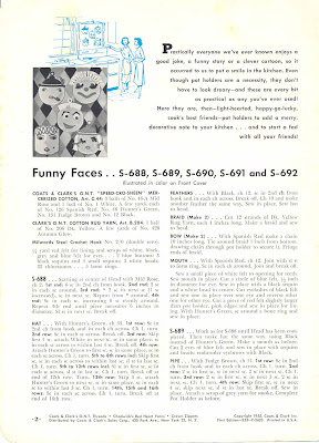
The Coates & Clark's Book No. 312 with "Funny Face" potholders on the cover is © 1955. The Funny Face Potholders Kit is © 1960 by Lisbeth Whiting Co. I found both of these items on eBay.


I didn't get these items at the same time and didn't realize at first that the kit was based on the same faces as the book. The potholders in the kit use thicker yarn and instructions adapted for children "ages 6 to 16." The next picture shows a side-by-side comparison of the designs.

funny face potholders

The inside of the book's front cover is shown below. this page includes instructions for the designs of the man and woman wearing feathered hats.

vintage face potholder pattern
click image to enlarge and read this!


Vintage Thingies Thursdays

Thursday, August 6, 2009

PFF & Postcard Scavenger Hunt #6 – My Funniest Postcards

This is my monthly Postcard Scavenger Hunt for August. If you are interested in participating, please read about how it works on my Announcing the Postcard Scavenger Hunt posting.

NOTE: You don't have to post today. The deadline is really at the end of the month so there is plenty of time to post. You also can put the permalink to an older post on the theme into Mister Linky. PLEASE only put a link here to a blogpost that fits the monthly theme--other links will be removed.

The theme for this month is My Funniest Postcards. Let's have fun with this theme. Pick out your funniest postcards and post them. Different people have different ideas of what is funny; just don't pick anything pornographic or likely to offend others. They can be comics, humorous photos, or whatever you think is REALLY funny.

My funniest postcards are ones that stand out in my mind from hundreds of funny, but forgettable, postcards. I always remember these.


This "Mary and Her Little Lamb" postcard is one of a series of old postcards on this subject. I have a couple of others that aren't quite so funny. This one was mailed in 1908. No publisher is listed.


This is a colorful linen comic made by Tichnor Bros., Inc.


This is a 1980s black and white comic by the artist Seth Feinberg. He also did other comics on postcard subjects. © Seth Feinberg's "No Danger to the Public Postcards."


This is a recent postcard by fotofolio. It is a 1981 photograph by © Michael Deines.


August Postcard Scavenger Hunt participants:


1. Viridian

2. Angie - Australia

3. Sheila

4. RandyC


Tuesday, August 4, 2009

View Postcard Types - Festival of Postcards - Minneapolis River and Lake Views

Since this month's Festival of Postcards is dedicated to WATER topics, I will illustrate the various types of view postcards with postcards from my Minneapolis postcard collection. Minneapolis is known as the "City of Lakes" and is located on the Mississippi River, so many Minneapolis postcards feature water scenes.

The most common type of view postcard is based on a photograph but actually is an image printed on ordinary paper on a printing press. Early printed postcards are based on black and white photos, either with or without added color. Later postcards are based on color photos.

Another type of postcard is the "real photo" postcard. Real photo postcards are printed directly on photographic paper from negatives.
Real photo postcards were popular for snapshots and studio portraits, especially before 1920. Real photo postcards can be distinguished visually by the way the image looks when magnified. Real photo postcards have continuous gradations of tone, while printed postcards have a dot or grain pattern. There are usually differences on the back of the postcard also that differentiate real photos and printed postcards.
This is an example of a real photo postcard. It shows "Y.P.S. Annual Outing July 14, '09, Swedish Salem Luth church at Lake Harriet." The stampbox on the back is bordered by the word "AZO" which was a popular type of photo paper used for postcards.
Collectors also classify postcards by the era in which they were produced. The following descriptions of postcard eras apply mainly to postcards sold in the United States. There is some overlapping of dates, especially with "linens" and "chromes," both of which were common in the mid-1950s.

Early Twentieth Century

The period from the beginning of the twentieth century until about 1913 is considered the Golden Age of postcards. Postcard collecting was a big fad during this period, and many postcards were saved. Prior to World War I, most of the quality postcards were printed in Europe. Postcard views from this era usually have good detail, deep colors, and no border. Real photo postcards were made in limited quantities on a variety of local subjects. Snapshots and portraits were also printed as postcards on photographic paper.

This example of an early twentieth-century postcard shows the "Milling District, Great Northern Railway Bridge and St. Anthony Falls."
White Border

White Border postcards were made mainly from about 1913 to 1932. Most of the postcards from this era are views with a white border around the picture and lighter colors. The printing is usually not as attractive as that on earlier postcards. Card stock usually has a smooth non-glossy surface. The white border made the cards easier to cut apart after printing. (Postcards from other eras sometimes have white borders, but would not be considered a "white border" type).

This example of a white border postcard shows "Canoeing on Lake of the Isles." According to the description on the back "Canoeing is a favorite sport in Minneapolis, and this is one of the seven lakes where canoeing is enjoyed during the summer season."


Linen

From about 1933 until the early 1950s most U.S. views and comics were printed on card stock with a linen texture on the picture side. The colors were usually bright or even gaudy. Real photos of tourist areas were also fairly common in this era. The real photo postcards from this period are almost always views and tend to be glossier and more contrasty than earlier ones.

This example of a linen postcard shows a "Barge Fleet Coming Through Locks of Mississippi at Ford Plant." This lock is between Minneapolis and St. Paul.


Standard Chrome

Chrome postcards have a glossy surface and are based on color photos. This type of postcard was first made in 1939, but was not dominant until the mid-1950s. Most U.S. postcards were "standard" size, approximately 3-1/2 X 5-1/2 inches, until the mid-1970s. Most standard size chrome postcards do not have titles on the picture side of the card.

This is an example of a standard size chrome postcard. It is also an example of the Name Band style of "Greetings From" postcards that replaced the Large Letter style of "Greetings From" postcards and were popular in the late 1950s and early 1960s. It pictures the Third Ave. Bridge over the Mississippi River near downtown Minneapolis and Sailboating on Lake Calhoun.


Continental Modern

Continental size postcards are approximately 4 X 6 inches. This size is called "continental" because it was common in Europe earlier than in the United States. Most, but not all, of the postcards sold in the U.S. since the mid-1970s are this size.

This example of a continental postcard is circa 1987. The view is described on the back as "Minneapolis, Minnesota skyline with the IDS towering above the remainder of the buildings. The Mississippi River and the Metrodome are also shown in the view." This is the only postcard I have that shows the old 35W Bridge that collapsed on August 1, 2007. The bridge in the foreground is the Tenth Avenue Bridge. Just above that is the 35W Bridge.


The YouTube video shows local TV news coverage of the bridge collapse. Much of the first half of the video takes place on the Tenth Avenue Bridge. The large red brick building is Florence Court, an old apartment building where I used to live.


This post was written forA Canadian Family
A Festival of Postcards Blog Carnival

4th Edition, August 2009: Water
Related Posts Plugin for WordPress, Blogger...